Before the 2015 debut of the iPad Pro, the iPad Air represented the best of what the iPad had to offer. It was thin, it was light, but most importantly, it was blazing fast, all while offering the same great battery life you’d come to expect from an iPad.
When the iPad Air launched, it was all about being “thin and light”. Apple noted it was “20 percent thinner and 28 percent lighter” than the iPad 4, with some claims about its performance thrown in for good measure. However, it was its successor — the iPad Air 2 — that became the pinnacle of the series.
At 437g, the iPad Air 2 is the lightest iPad Air to date, and it brought “40 percent improvement in CPU performance and 2.5 times the graphics performance” compared to the iPad Air, underlying its claim of being the fastest iPad at the time.
I was excited enough to pick up an iPad Air 2 at launch, and it lived up to the promise, and more. Unsurprisingly, that particular iPad is still going strong in our family — we also continue to find a use for an iPad 2 that just refuses to die — and I’d go as far as to say that it’s my favourite non-Pro iPad till date.
Sadly, that’s as good as the iPad Air line got for a while. The iPad Air 2 was unveiled in October 2014, and for the next five years, the line didn’t see any updates at all.
In part, this was down to the fact that during its later years, the iPad Air 2 was fast enough for everyday use. However, it wouldn’t be inappropriate to say that the main reason was neglect. A little over a year after the launch of iPad Air 2, Apple introduced the first iPad Pro, and the line saw constant refreshes over the next half-a-decade.
Last year, Apple took a break from releasing new iPad Pro models to unveil the iPad Air 3, which bridged the gap between the two lines by adding support for the Apple Pencil, Smart Keyboard, as well as other features that had hitherto been exclusive to the ‘Pro’ line.
2020 has been another solid year for nearly the entire iPad lineup, with the release of new iPad Pro models — as well as Magic Keyboard with a trackpad — in March, and the launch of a ‘regular’ iPad in September. However, it was the iPad Air 4, which was also announced at the September event, that caught my eye, and much like the iPad Air 2 six years ago, I was excited enough to order one at launch.

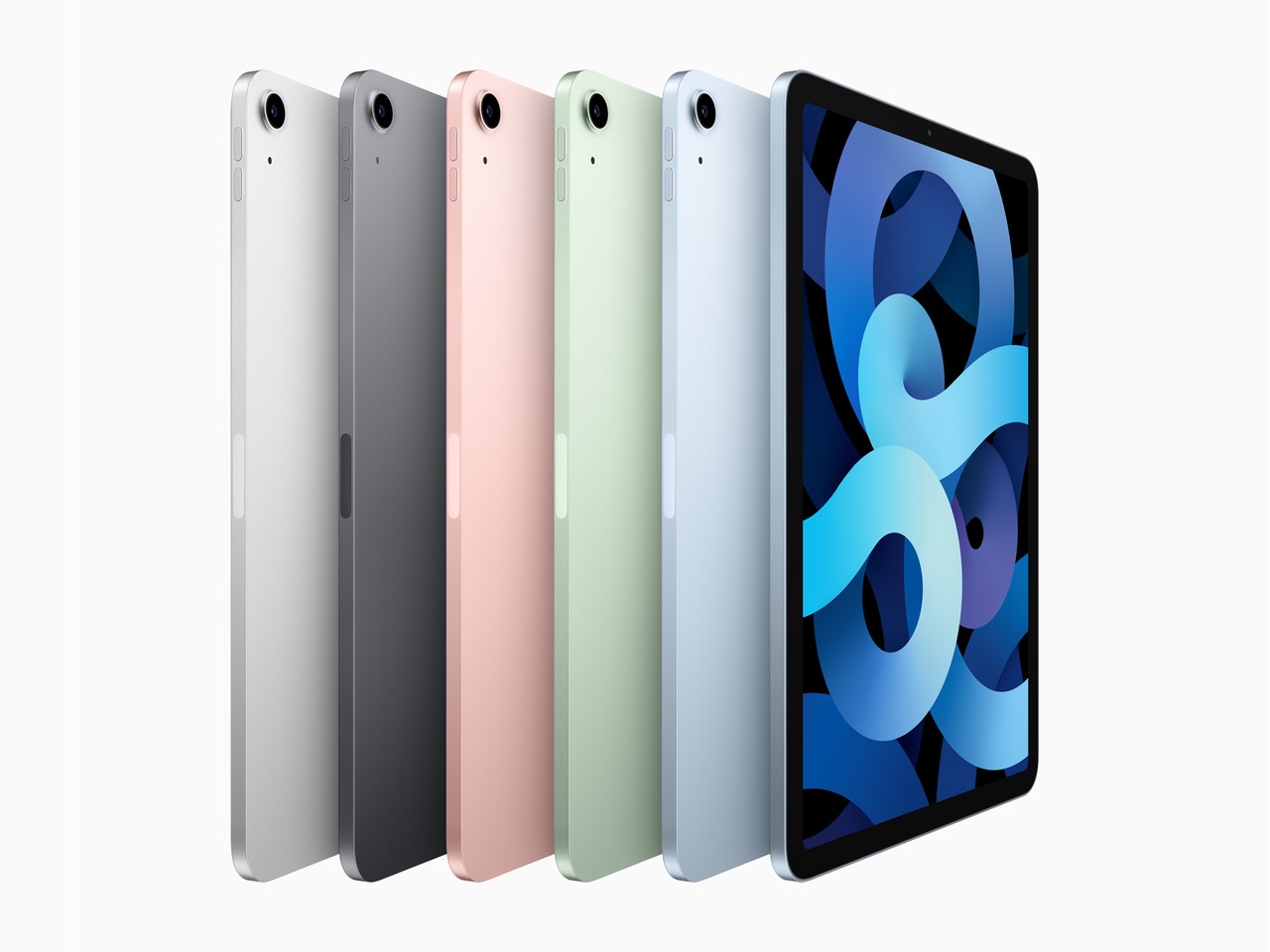
The iPad Air 4 is available in new Green and Sky Blue options, in addition to the Silver, Space Grey, and (Rose) Gold colours of its predecessors. The Sky Blue variant I ordered has a very understated finish — even more than the Midnight Green finish on the iPhone 11 Pro models — and I struggled to see the “blue” from which it derives its name.
Having said that, I didn’t spend any time using this iPad outdoors or in the sun — which makes limited appearances in this part of the world, especially at this time of the year — and I expect the blue to seem a bit more pronounced when light bounces off it. Of course, all this is moot if you plan to cover the iPad’s body with a case or a keyboard.
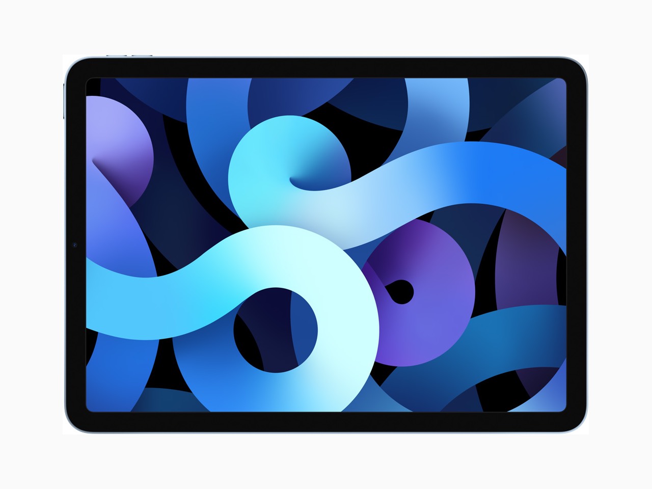
The iPad Air 4 takes its design cues from the iPad Pro, getting rid of the home button, which allows for thinner bezels at the top and bottom. That change, coupled with a slightly wider body (7-inches, compared to 6.8-inches on the iPad Air 3), means Apple was able to ship a larger 10.9-inch display on the iPad Air 4, compared to 10.5-inches on its predecessor.
Visually, the iPad Air 4 looks identical to the 2018 iPad Pro that has been a near-constant companion of mine for the last couple of years. Apart from the smaller display — I use a 12.9-inch Pro — and as a result, the slightly cramped keyboard (more on that later), the main thing that took some time getting used to was the lack of Face ID.

Face ID is great on the iPhone, and despite my initial reservations, it’s safe to say that the best implementation of Face ID is on the iPad, not least because it works in both portrait and landscape orientations, something the iPhone lacks to date. However, it’s not until you go back to using a fingerprint scanner that makes you appreciate the speed and convenience you take for granted on a device with Face ID.
The first couple of days were a bit rough, but pretty soon I got used to putting my index finger down on the power button while sitting down to work on the iPad. What I continue to find annoying to this day is that Touch ID on the iPad Air 4 is a tad slower than the last time I used it on an iPhone.
Of course, it would be unfair to compare Touch ID on the iPhone — where it’s embedded in front-facing home buttons where your entire finger can be scanned — to the one on iPad Air 4 where only part of your finger can be scanned at any given time. This means you need to rest your finger on the button a little bit longer for it to get a good-enough scan.
That’s hardly a surprise given this is effectively a first-generation Touch ID sensor and Apple has done a good job with the software, with little touches like the “Rest to Open” message that pops up on the screen to remind you to take it a bit slow when trying to unlock the device.

There are some tweaks to the Touch ID setup process as well, with a reminder to rotate the iPad and register another finger to account for the different orientations in which you’ll end picking up the iPad.
I’d be curious to hear from someone making the move from an iPad Air 3 to this one on what they make of the placement and performance of the new Touch ID sensor. In the absence of that information, I have a feeling that at least some of the things that I’ve mentioned might be limited to those moving from an iPad with Face ID to this one.
Apart from the increase in size (and the additional pixels that it brings), the display is virtually identical to one of the iPad Air 3. This means you get True Tone and support for the P3 colour gamut, but no ProMotion and a slightly lower peak brightness compared to the iPad Pro models (500 nits, as opposed to 600 nits). I like having ProMotion on the iPad Pro, but I didn’t particularly miss it on the iPad Air 4, and I imagine that’d be the experience of most (but definitely not all) users.
What I did notice is that just like the iPad Pro models, the additional pixels on the iPad Air 4 mean you get small black bands on either side when using certain (read unoptimised) apps in landscape mode.
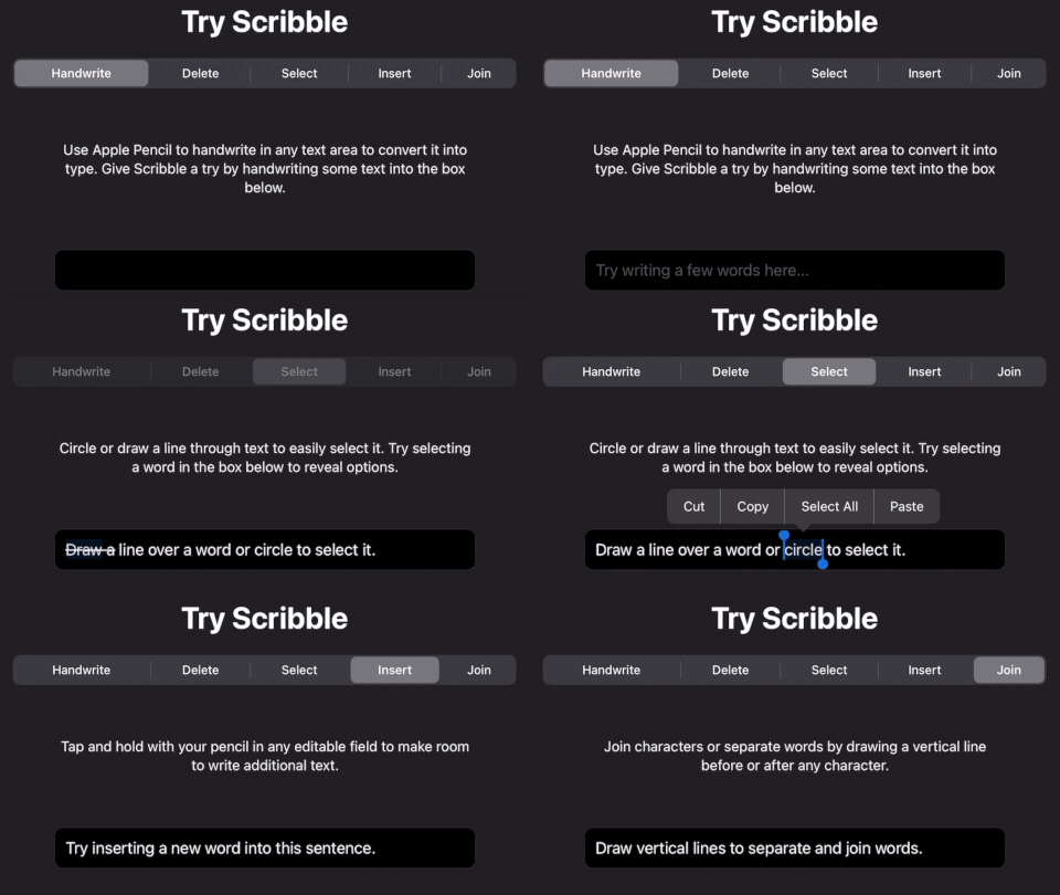
The iPad Air 4 brings support for the second-generation Apple Pencil — its predecessor supported the original Pencil — and there are a bunch of software enhancements to make the Pencil a bit more useful in certain contexts.

With that said, I’m frustrated that you still can’t use the Pencil as a replacement for simple finger-based gestures to, say, swipe up to go back to the home screen, which I find a bit baffling. Overall, as I’ve said before, the Pencil is a nice add-on for artists as well as those who prefer taking handwritten notes but — strictly in my opinion — it isn’t a “must-have” to go with your iPad Air/ Pro, unlike a keyboard which I can’t recommend enough.
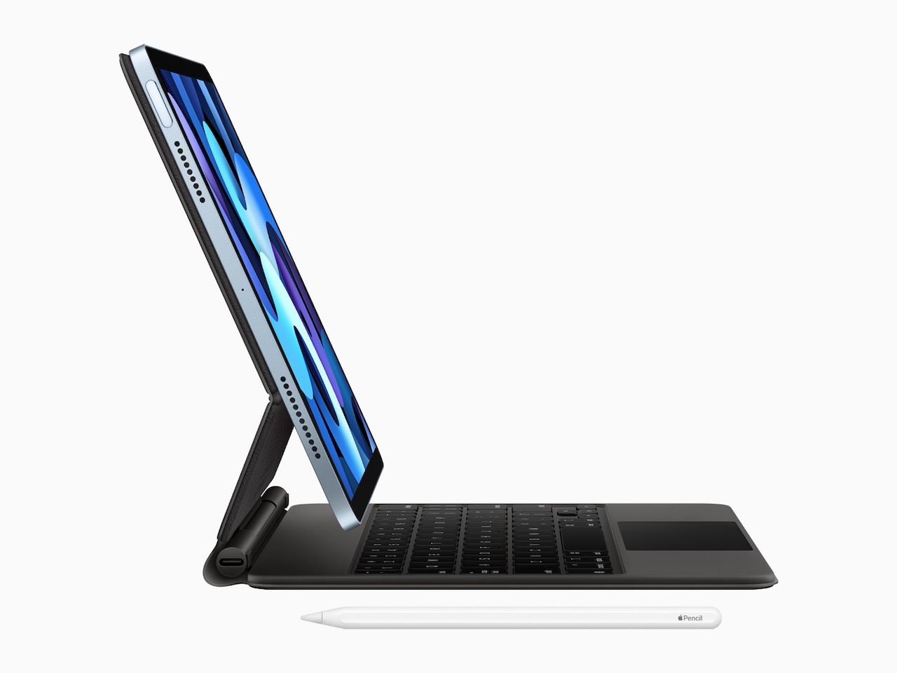
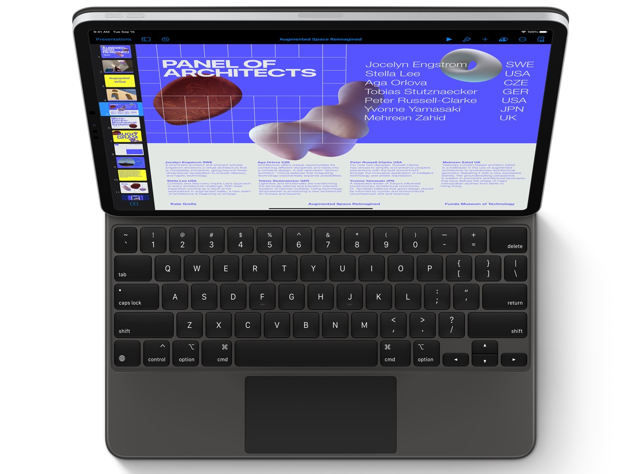
Which brings us to the Magic Keyboard with its “floating design” and built-in trackpad. Apple introduced this accessory in March with new iPad Pro models, but I hadn’t used one for an extended amount of time until I got my hands on the one I ordered to go with the iPad Air 4.
The keyboard is the same model that works with the 11-inch iPad Pro — I imagine maintaining this compatibility was a big part of the reason Apple increased the size of the iPad Air 4’s display — and the first thing I noticed was how heavy it is. I remember reading reviews of the Magic Keyboard earlier this year and all of them made references to the weight (and the magnets that are almost entirely the reason behind it) but I was still surprised when I first held it in my hands.
I received the iPad Air 4 and the Magic Keyboard as two different shipments on different days, and the second I held the box containing the keyboard, I realised how heavy it was compared even to the iPad box I received a day earlier.
By itself, the iPad Air 4 weighs 464 grams, while the keyboard weighs 608 grams. Combined, the two weigh a bit more than the combination of 12.9-inch iPad Pro and Smart Keyboard Folio that’s been my daily driver for a while. The difference isn’t much, but it was definitely noticeable.
| Device |
Weight |
| 12.9-inch iPad Pro (2018) |
636g |
| 12.9-inch Smart Keyboard Folio |
407g |
| iPad Air 4 |
464g |
| Magic Keyboard for iPad Air 4 |
608g |
| Apple Pencil (2nd gen.) |
17g |
Of course, the design of the Magic Keyboard is meant to alleviate this a bit by making it easier to quickly detach the iPad when you don’t need the keyboard, which means you are carrying around less weight in certain situations. In practice, though, that action didn’t come naturally to me at all, possibly because I’m set in my ways as a Smart Keyboard Folio user.
The Magic Keyboard is backlit, and since it draws power from the iPad, Apple is pretty aggressive in terms of managing when the lights comes on, and how quickly they are turned off. Without a dedicated row of function keys, there are no hardware controls to quickly increase/ decrease the brightness manually, though it can be controlled via Settings.
In terms of the actual typing experience, the Magic Keyboard reminded me of third-party keyboards from the likes of Logitech that I’ve used in the past. By that, I mean that the keys feel plasticky (without feeling cheap) and the scissor mechanism has more travel (1mm to be precise) than what you get with the fabric-finished Smart Keyboard Folio.
The new keyboard hasn’t significantly improved my typing experience, though I’m willing to concede this could well be down to years of living with the Smart Folio Keyboard as well as other keyboards with low travel (my work laptop is still a 2019 MacBook Air with the old Butterfly keyboard) and having accepted them at this point (Also see: death and taxes).

Apple introduced native mouse and trackpad support in iPadOS 13.4, complete with snapping the pointer to nearby controls to help you find your way around. The idea is to minimise — if not completely eliminate — the number of times you have to reach out and touch the screen.
Additionally, the trackpad can also be used for gesture-based navigation. For example, you can swipe up with three fingers in any app to go back to the home screen, or use the three-finger swipe left/ right to move between apps. Of course, these gestures are also available if you have an external trackpad like the Magic Trackpad 2.
The trackpad is especially helpful if you are using the iPad with a monitor, something I do quite often at work. With the Smart Folio Keyboard alone — or even if you throw a mouse into the mix — you still need to keep tapping the screen to accomplish certain tasks.
This means you need to switch between the monitor and the iPad regularly, and ever so often I find myself focusing on just the iPad and forget that I have a bigger display attached, just because it’s simpler. The Magic Keyboard for iPad managed to change that.

Once I trained myself to use gestures and the on-screen pointer instead of reaching out to touch the iPad for every little thing — which admittedly took a couple of days of conscious effort — I found myself being a lot more productive when working with an external screen. In that sense — and I know I’m a few months late on to this — the iPad and Magic Keyboard offer a “true laptop experience” that wasn’t possible earlier.
The trackpad — or more specifically the pointer — also came in handy when finding my way around data points on graphs, and when using apps like Remoter Pro to VNC into a Mac Mini, something I find myself doing very often.
However, when I balance these conveniences with the extra weight that the Magic Keyboard adds to the package — and its eye-watering $299 (Rs. 27,900/ SEK 3,695) price tag — I don’t consider it to be an essential upgrade for my needs, and I’m quite happy sticking with the Smart Keyboard Folio instead.
Though I haven’t used the iPad Air 4 with a Smart Keyboard Folio yet, the experience wouldn’t be any different than using it with an iPad Pro, and that’s something I have covered in-depth earlier. One thing you need to keep in mind regardless of the type of keyboard you choose is that due to their smaller size, the keyboards that get paired with an iPad Air 4 (or the 11-inch iPad Pro) will always feel a bit cramped.
This is something most people get used to pretty quickly if the iPad is the only device they use, but if your workflow involves juggling between an 11-inch table and a 15-inch laptop, for example, it gets harder to transfer your muscle memory between the two devices.
The Magic Keyboard, of course, also includes a USB Type-C port. While it can only be used for charging, at least that leaves the one on the iPad free for other tasks. That’s right, the iPad Air 4 is the first non-Pro iPad to pack a Type-C port. I connected a 27-inch Dell 4K monitor with the iPad — both via the Type-C port, and with an HDMI port connected via a Type-C dongle — and it had no trouble driving the display at full resolution.
The iPad Air 4 is powered by the A14 Bionic, which also appears in the iPhone 12 line. Unsurprisingly, I didn’t notice any performance issues with the iPad Air 4, but in day-to-day tasks, I didn’t spot any significant gains compared to my 2018 iPad Pro, though that’s more to do with the latter’s competence than a slight on the newest chips.
When it came to benchmarks, the iPad Air 4 comfortably outscored the two-year-old iPad Pro in single-core tests, which was hardly a surprise given the year-on-year improvements Apple’s amazing silicon team continues to deliver. In multi-core benchmarks though, the iPad Pro more than held its own thanks to the four high-performance cores inside the A12X, as opposed to two on the A14 Bionic.
| Benchmark/ Score |
iPad Air 4 |
12.9″ iPad Pro (2018) |
| Geekbench single-core |
1598 |
1129 |
| Geekbench multi-core |
4289 |
4482 |
| Geekbench Metal |
12182 |
10915 |
Though the iPad Air 3 had stereo speakers, both the drivers were near the home button, while with its successor Apple has positioned them on opposite sides, giving you clearer left-right separation when you hold the iPad in landscape mode. The resultant sound isn’t quite as room-filling as you get with an iPad Pro, but it’s an upgrade nonetheless.
As far as battery life is concerned, well, it’s an iPad, which is to say you won’t have any complaints. The iPad Air comes with a 1m Type-C to Type-C cable and a 20W Type-C charger in the box, which should make for a faster charging experience.
Apple has made a bunch of improvements in the rear camera — including a 12-megapixel ƒ/1.8 wide camera and 4K 60 fps recording, both significant improvements — but I have no interest in being the guy who takes pictures and shoots videos with his iPad so I haven’t tested the cameras at all. Improvements in the front camera department — which would’ve surely had broader appeal — are minimal, with the iPad Air 4 adding support for 60fps recording and Smart HDR.
iPadOS 14 brings a host of features, big and small, most significant of which seem to be the Pencil-related improvements mentioned earlier.

I did run into a few minor bugs though — one time the trackpad pointer disappeared, and in the other instance the iPad stopped responding to Apple Pencil’s input. On both occasions, I had to restart the iPad for things to go back to normal.
By themselves they don’t seem like issues worth bringing up here, but I don’t recall facing anything similar with the iPad Pro at any time during the last couple of years, so these instances stuck out more than they probably should have. On the face of it, they definitely sound like early bugs that future software updates should fix.
Another change I would like to see is the evolution of multitasking on the iPad. What I miss, for example, is the ability to keep an app pinned on the right fourth of the screen, while using Command-Tab to cycle through other apps on the left. Apple offers Slide Over to achieve a similar effect, but it isn’t quite the same since it ends up covering parts of the “main” app.
Even as we wait for the software to evolve, it’s clear that the iPad Air 4 blurs the line between the iPad Air and iPad Pro. With the inclusion of a bigger display, a Type-C port, as well as the A14 Bionic — which puts the iPad Air 4 ahead of the iPad Pro line in terms of single-core and GPU performance, at least until the Pro line is updated — the iPad Air 4 has the 11-inch iPad Pro within its sights.
With a $200 (Rs. 17,000 in India, and nearly 3,000 SEK in Sweden) price difference between their starting prices, you would think the iPad Air 4 would be a no brainer. So let’s recap everything you’d miss out on if you picked up the more affordable offering — you’d lose Face ID, ProMotion display, LiDAR scanner, and will have to settle for worse cameras and speakers, as well as 64GB of storage.
That’s right, while the iPad Pro base model packs 128GB of storage, the iPad Air 4 starts at a meagre 64GB. While some believe that’s too little for any meaningful work — and I agree that it isn’t ideal — I don’t think it’s a deal-breaker either, especially if you don’t typically use more than a handful of apps.
If, however, you are a gamer, or you like keeping a ton of media available on your device for offline use, you might want to consider spending a little extra to get the 256GB variant of the iPad Air 4. At that price point though, you’re nearly in the iPad Pro territory and save for the A14 Bionic, the iPad Air 4 doesn’t look as appealing in comparison.
If you are okay with the base model, you can pick up an iPad Air 4 and a Smart Folio Keyboard for roughly the price of a 10.9-inch iPad Pro. The only other thing you need to keep in mind — especially if you are looking at this as a “laptop replacement” — is if you’d be okay with the size.
| Device |
Price (USD) |
Price (INR) |
Price (SEK) |
| iPad Air 4 (64GB) |
$599 |
₹54,900 |
SEK 7,075 |
| 11″ 2020 iPad Pro (128GB) |
$799 |
₹71,900 |
SEK 10,088 |
| iPad Air 4 (256GB) |
$749 |
₹68,900 |
SEK 8,888 |
| 11″ 2020 iPad Pro (256GB) |
$899 |
₹80,900 |
SEK 11,288 |
| 11″ Smart Keyboard Folio |
$179 |
₹15,900 |
SEK 2,095 |
| 11″ Magic Keyboard |
$299 |
₹27,900 |
SEK 3,695 |
| Apple Pencil (2nd gen.) |
$129 |
₹10,900 |
SEK 1,495 |
Most people use laptops that are bigger than 11-inches, so switching to a 10.9-inch tablet might feel like a downgrade. Personally, while I appreciate the extra portability of a smaller device in certain situations, I prefer the additional real estate that my 12.9-inch iPad Pro offers, and I wouldn’t be happy using anything smaller on a daily basis.
If you already have an iPad Pro with Face ID, you are better off waiting for future updates to the Pro lineup, but you don’t need to hear that from me. If you have a 10.9-inch iPad Pro, though, you will have an interesting decision to make when it’s time for your next purchase, and I have a feeling that many would opt for an iPad Air instead.
